Elevating Design Systems with Thoughtful Typography
In my opinion, typography is one of the most important aspects of UI design. It goes far beyond just picking pretty fonts—it’s about creating a visual structure that guides users and ensures they can easily interact with content. Good typography improves readability, accessibility, and navigation, making sure the user experience feels intuitive and smooth. The right font choices and text hierarchy don’t just inform users—they shape their entire interaction with the interface, helping them understand and engage with the product more effectively. For me, typography is an essential tool in crafting seamless and memorable digital experiences.
Prioritize Legibility and Consistency
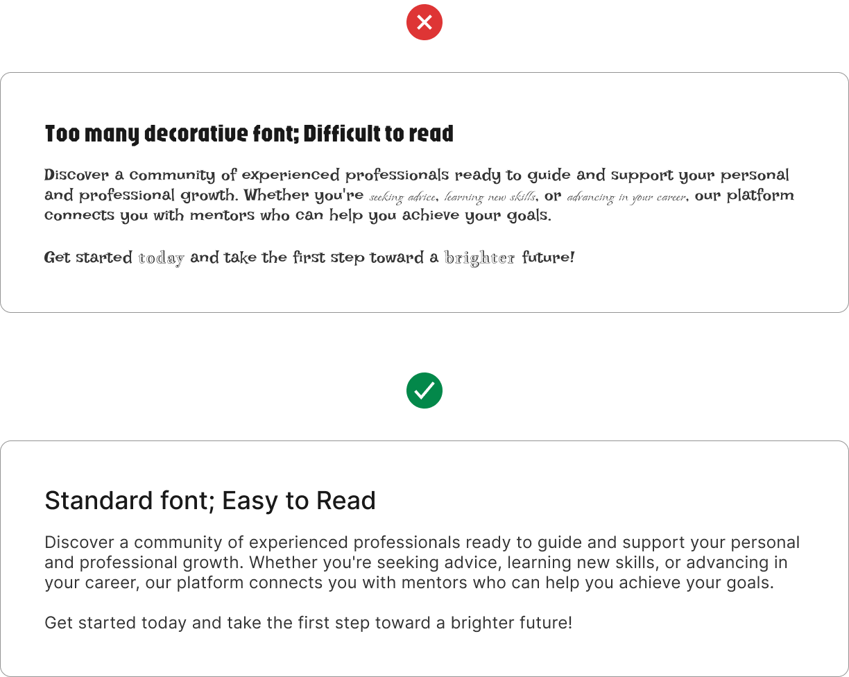
The main goal of typography in UI/UX design is ensuring that users can read the content effortlessly. Choose typefaces that are clear and easy to read across various screen sizes and resolutions. Avoid fonts that are overly decorative or too thin, as they can reduce readability, especially on smaller screens. For digital interfaces, sans-serif fonts like Roboto, Inter, or SF Pro are commonly used.
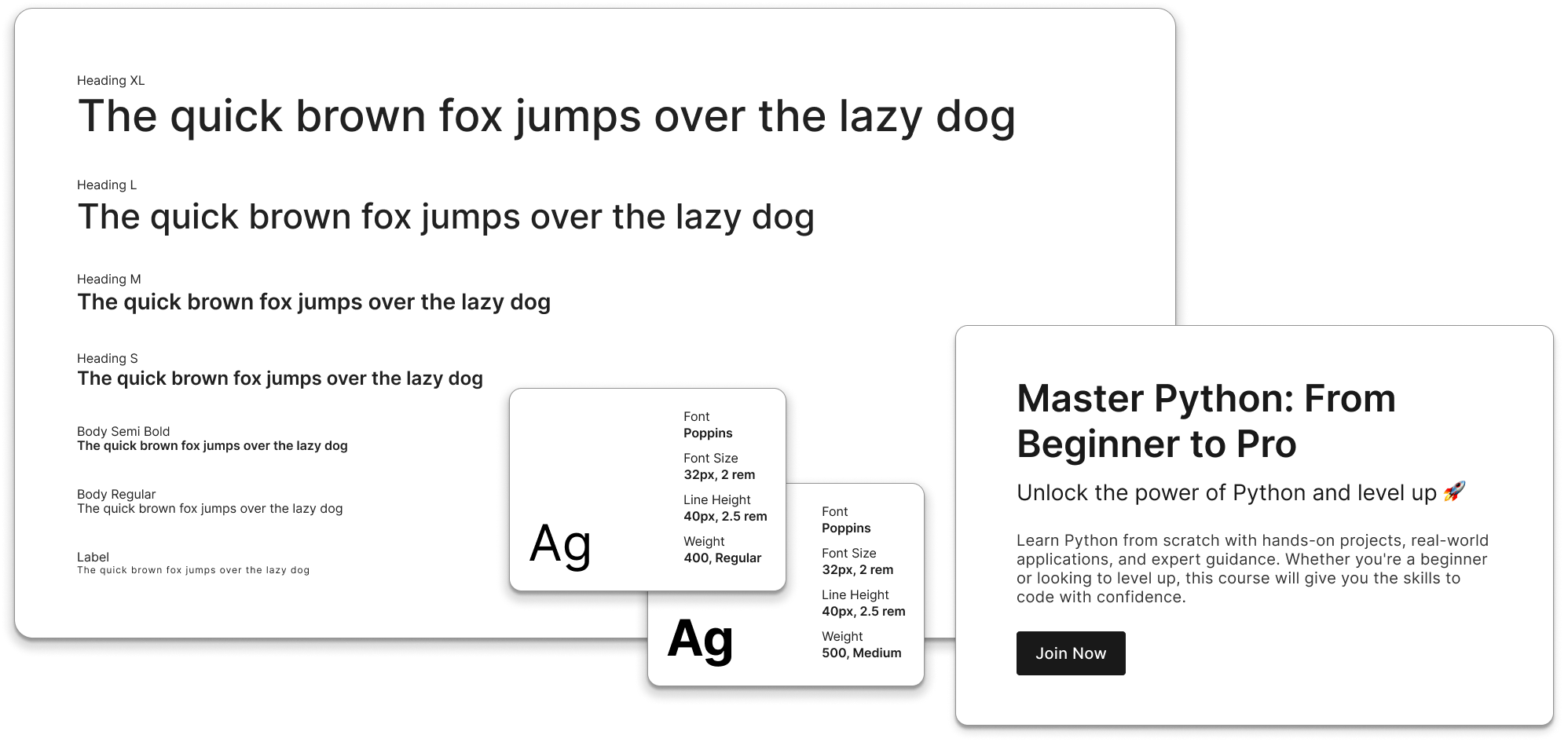
Consistency is key in design systems. Stick to a defined set of typefaces, font sizes, weights, and styles throughout your interface to create a cohesive look. This ensures that users are not distracted by inconsistency and that content flows logically across different pages and screens.
Choosing Typescale
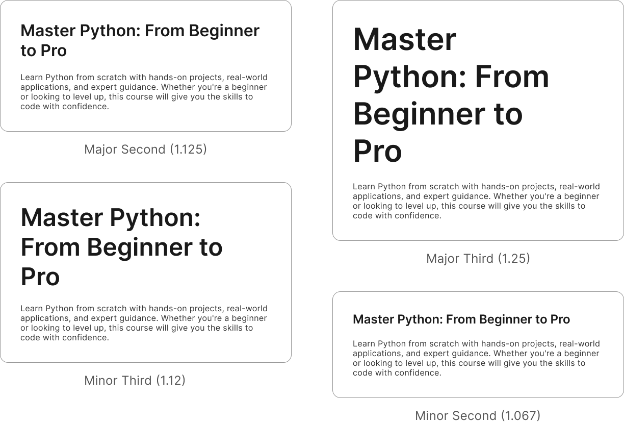
Choosing a type scale involves balancing readability, hierarchy, and responsiveness to create a consistent and visually appealing design. It starts with defining a base font size, typically 16px, which serves as the foundation for scaling text sizes. A type scale ratio determines how text sizes increase for headings, subheadings, and body text. Some commonly used ratios include 1.067 (Minor Second) and 1.125 (Major Second) for subtle variations in compact UI designs, 1.2 (Minor Third) for UI-heavy interfaces, and 1.25 (Major Third) for balanced and readable web designs.
Establish a Clear Visual Hierarchy
Typography plays a key role in guiding users through your content. Use different font weights, sizes, and styles to establish a clear visual hierarchy. Headlines should be bold and larger to grab attention, while body text should be more moderate and easy to scan. Subheadings and captions should provide a structured support system to further break down content.
Consider Readability Across Devices
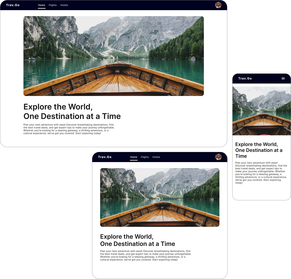
Different devices and screen sizes require thoughtful typography adjustments. Ensure your typography scales well on mobile, tablets, and desktop screens.
Align Text for Maximum Readability
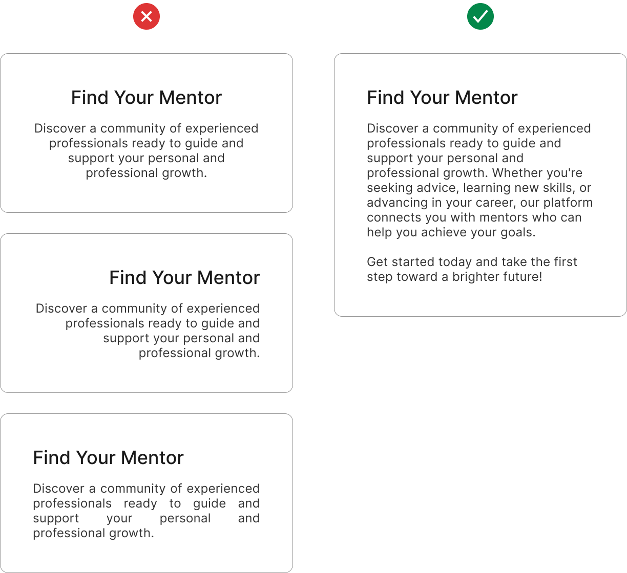
Aligning text properly is essential for readability and a smooth user experience. Left-aligned text is the best choice, especially for languages that read from left to right, as it follows natural reading patterns and makes content easier to scan. Justified text, on the other hand, should be avoided as it can create uneven spacing and make reading more difficult. Proper text alignment ensures a clean, organized layout that enhances clarity and accessibility.
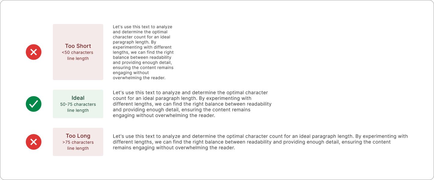
Mind the Line Length
Lines of text that are too long or too short can make reading uncomfortable. Aim for a line length of around 50–75 characters per line to optimize readability.

