
Design System
I led the creation of a Design System by playing a key role in establishing a cohesive design language, maintaining design tokens, and developing new components and patterns.
Accessibility was a key consideration. My team integrated features such as improved color contrast, keyboard navigation, and compatibility with assistive devices to create an inclusive user experience. Throughout this process, close collaboration with the engineering team was crucial to ensuring that design decisions aligned with technical constraints, resulting in the seamless and efficient integration of the design system into products.
UI/UX Methodologies
UI Design, Style Guide, Pattern Library, UI Inventory, UX Audit, QA of Implementation
Duration
March 2024 - February 2025
Company
Viral Nation
ProblemHow can we create a scalable and flexible design system from the ground up?
Style Guide
I led the establishment of this standardized guideline, which defines the visual and functional aspects of our product while maintaining brand identity.
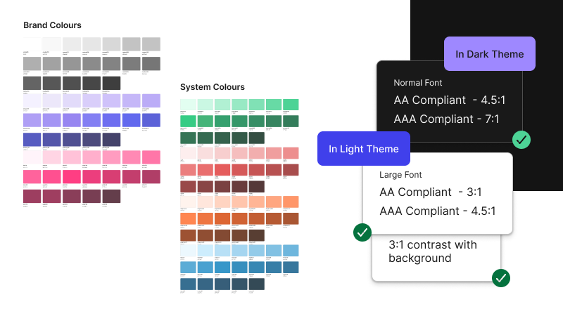
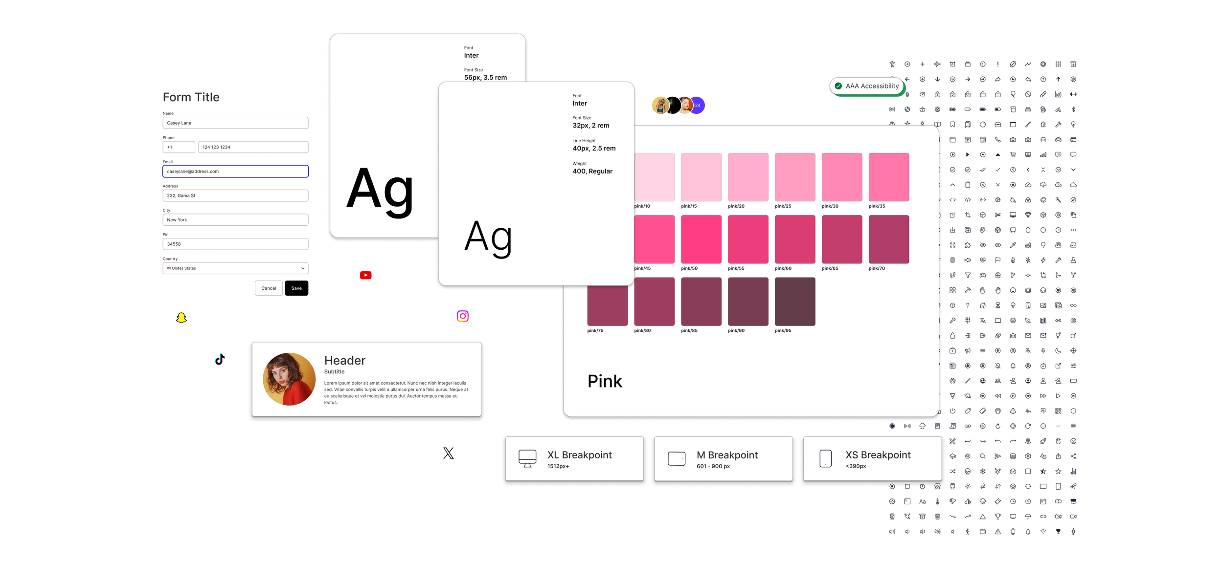
Colours 🎨
The colour palette was thoughtfully chosen to reflect the brand’s bold and engaging identity while maintaining a reliable and timeless appeal. When applied across various design elements, it was ensured that the colours consistently met the AAA standards of the Web Content Accessibility Guidelines (WCAG), ensuring high accessibility.
Both light and dark themes were carefully considered to ensure a balanced and inclusive design.
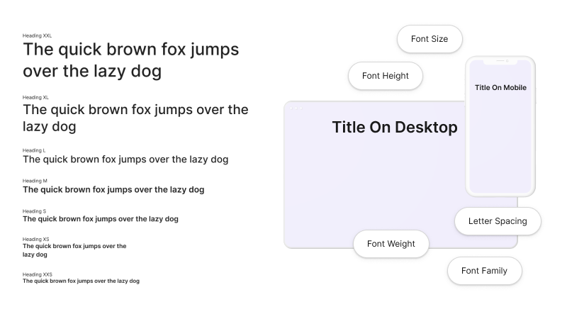
Typography 🔠
A clear typographic hierarchy was established, with font properties designed to improve legibility at various text sizes, ensuring seamless adaptation across different device sizes.
Followed a "rem for fonts and px for padding" approach, where font sizes were defined using the "rem" unit for scalability based on the user's browser settings, while padding was set in "px" to maintain precise spacing control, independent of font size preferences. This approach ensured both flexibility in text and consistency in layout elements.
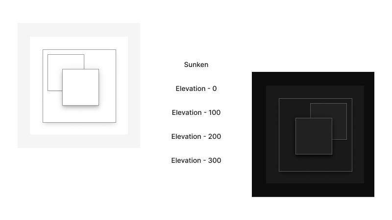
Elevations and Shadows 🥞
A layering model was implemented for elevations to create a sense of depth, with distinct guidelines for both light and dark theme layering. In the light theme, shadows and borders define each layer, while in the dark theme, each layer is a shade lighter than the one beneath it, maintaining visual hierarchy.
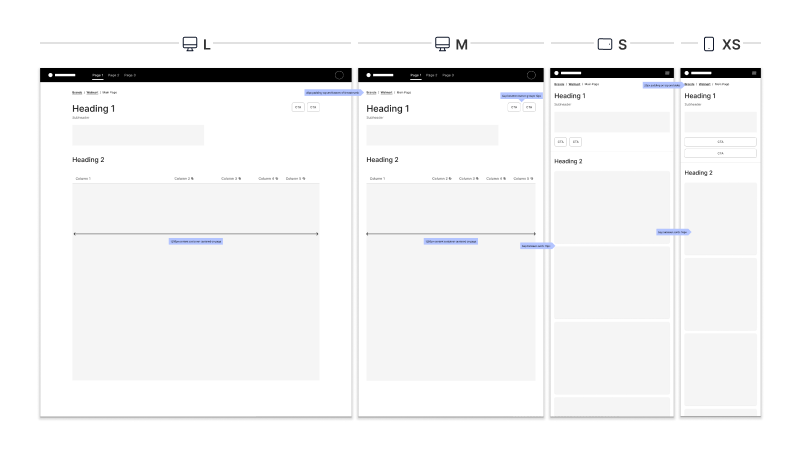
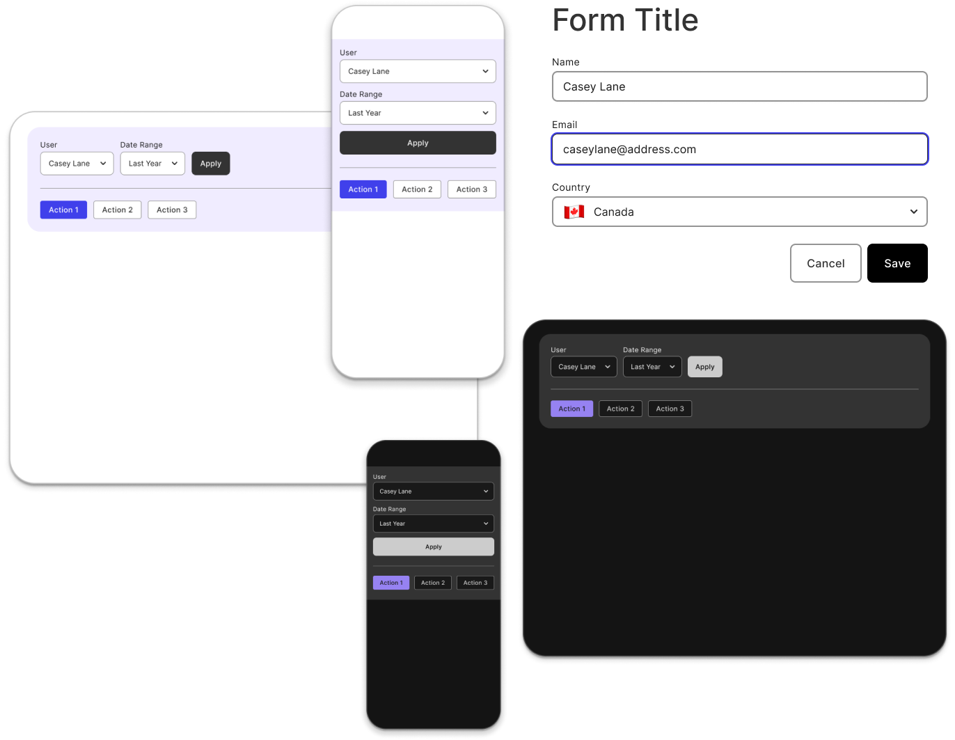
Layouts 📱
The gridless design approach was adopted to create flexible, content-driven layouts that seamlessly adapt to the platform, removing the constraints of rigid grid structures.
It prioritizes accessibility by allowing content to flow naturally, enabling elements like buttons to adjust based on text length rather than being confined to a grid. This results in a more intuitive, adaptable design that considers user preferences and content context while preserving visual balance.
Token Structure
In design systems, a token structure defines predefined values for key design properties such as colours, typography, and spacing, ensuring consistency and scalability across the product. Here is a breakdown of the token structure and nomenclature implemented in our design system:
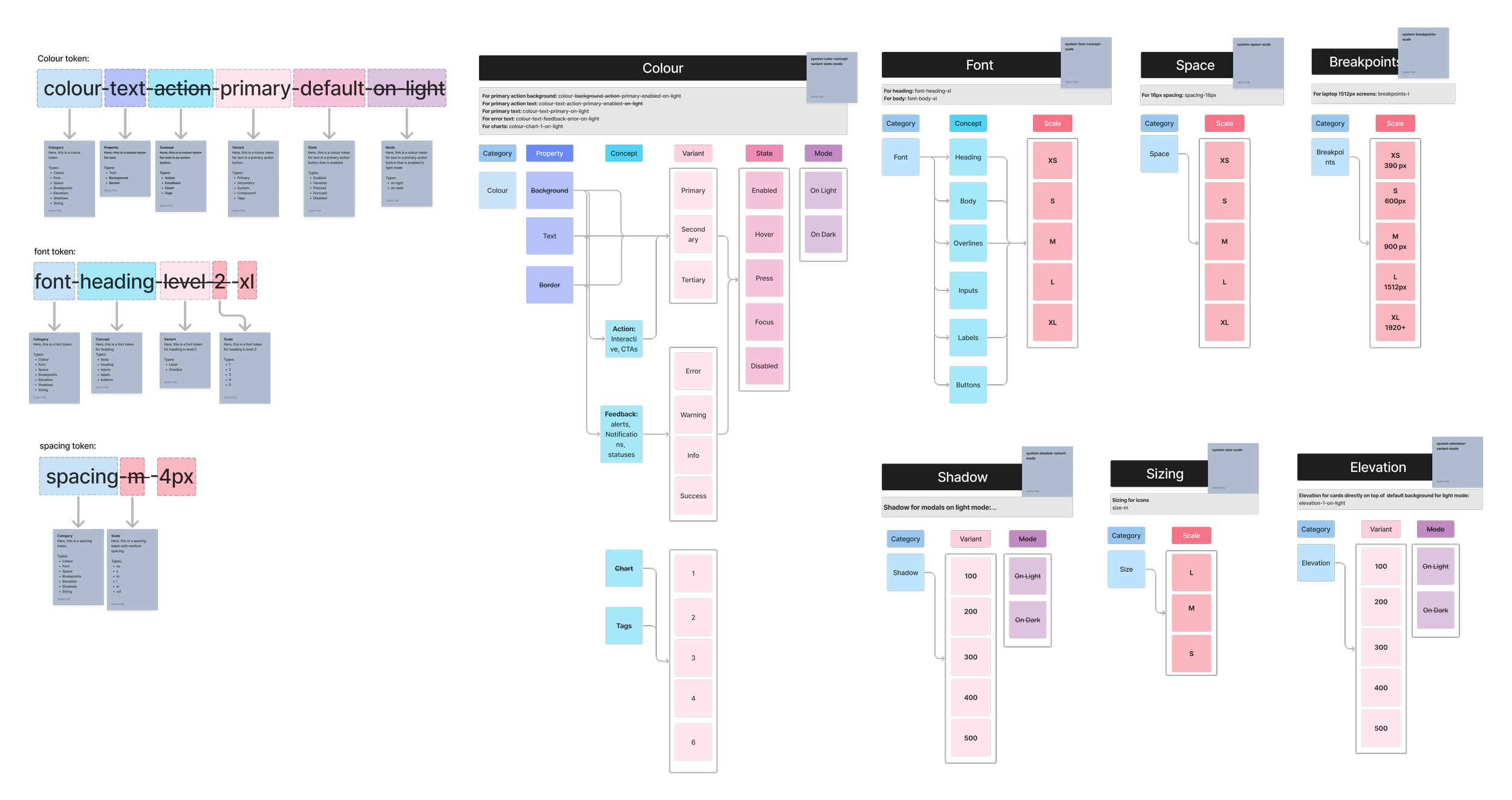
I handled tokens as variables in Figma, primarily focusing on primary and semantic tokens, while creating additional component-specific tokens when required.
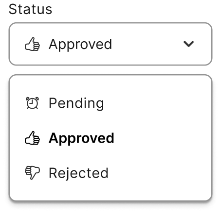
Library
Careful thought went into prioritizing components for design and development. I led the design of selected components, defining attributes, states, and variants, which expanded into a pattern library with usage examples.
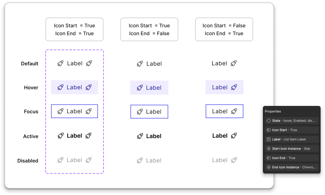
Reusable Components 🧱
A comprehensive design kit was developed, featuring a library of symbols, components, and reusable design assets. This kit served as a central resource for the team, ensuring consistency across projects with standardized elements like buttons, form fields, filters, and pagination.
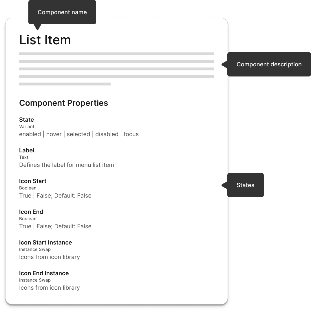
Documentation 📜
The documentation included detailed explanations of each component’s use cases, along with examples and guidelines for their application. It also featured annotations and descriptions, as well as information on state change attributes.
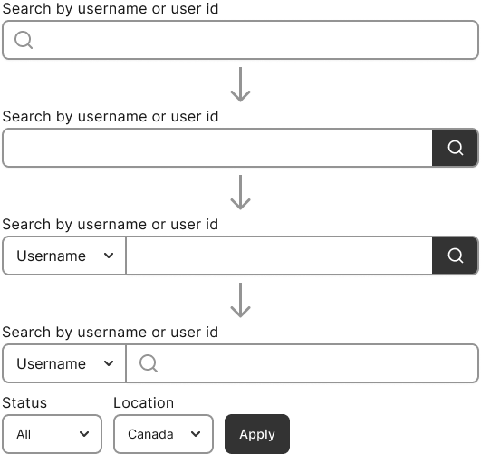
UI Patterns and Recipes 🧩
UI patterns were defined by grouping components to create consistent layouts and templates for reuse across the product. This approach ensured cohesive design, improved usability, and accelerated the design process by providing adaptable structures for different use cases.
Scalable and Evolving 🕓
The design system is built to evolve and adapt, allowing it to stay flexible as requirements change over time. As new needs arise, the system is continuously updated to ensure it remains relevant and effective in supporting the product's growth.
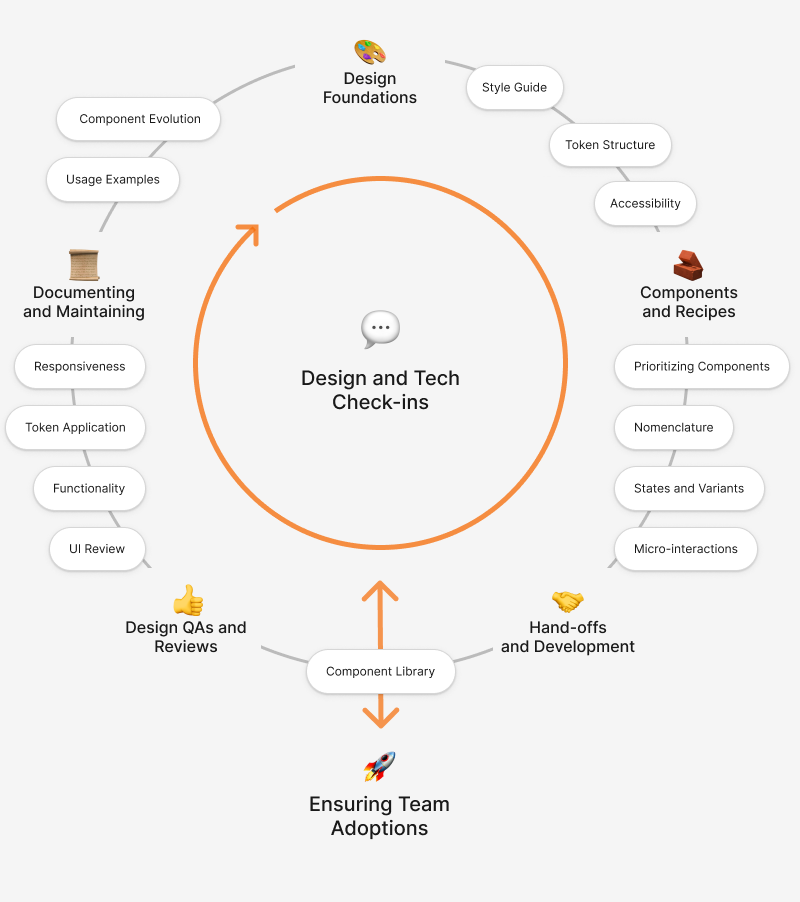
Design System Evolution
Design Foundations and Style guides 🎨01
Components and recipes 🧱 02
Hand-offs and Development 🤝03
Design QAs and Reviews 👍04
Documenting and Maintaining 📜05
Collaborations
I collaborated closely with engineers through regular check-ins. The discussions focused on topics like UX, tokenization, and component performance to lay the groundwork for a scalable design system.
Refinements
Ongoing discussions and quality checks were woven into the development process. By adopting Agile methodologies, we fostered an iterative approach that allowed for flexibility and continuous refinement.
Adoption
Workshops and cross-functional teamwork were key in driving adoption, ensuring a robust, evolving design system. This process fostered team-wide alignment and consistency across products.
Key Takeaways
Collaboration with cross-functional teams and continuous check-ins are crucial for creating a scalable and efficient design system.
Striking a balance between providing rigid guidelines and allowing flexibility ensures consistency while encouraging creative solutions and adaptability.
The importance of setting metrics to measure impact
Getting team members to consistently adopt the design system requires clear guidelines, ongoing education, and a culture of collaboration.
Other Works
Content Planner
Brand Reputation Management