Enhancing the Sign-Up Experience
Imagine you're excited to try out a new app. You click "Sign Up," ready to get started—only to be met with a long, confusing form asking for unnecessary details. You struggle to remember another password, mistype your email, and get vague error messages. Frustrated, you close the app and move on.
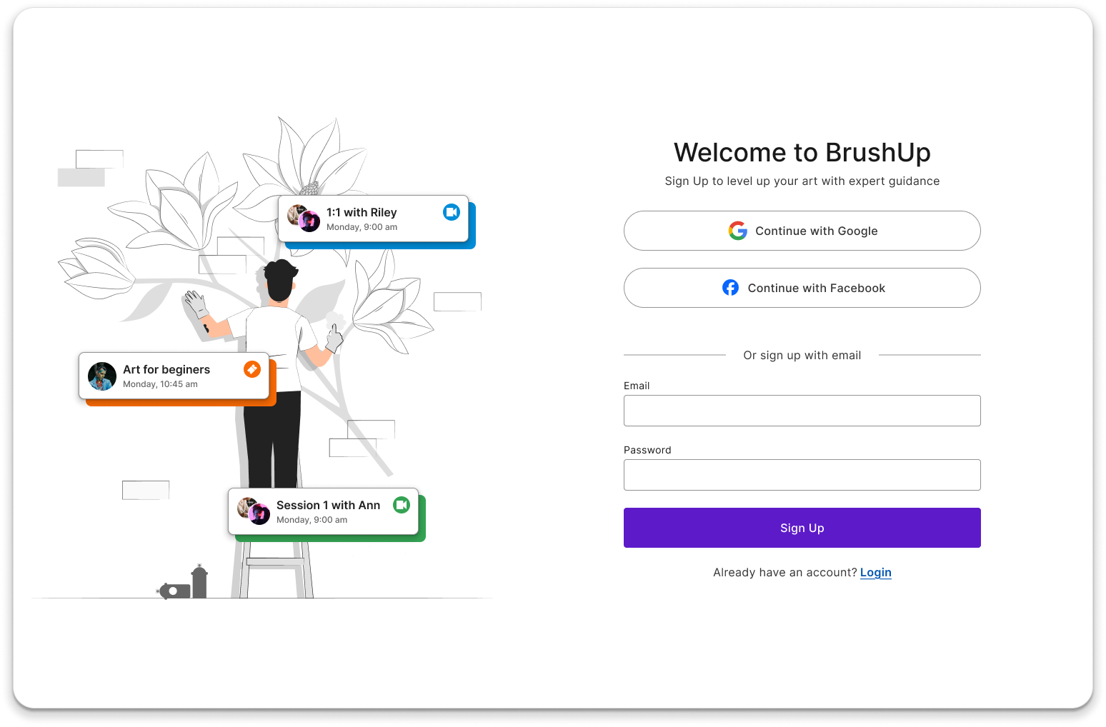
Now, picture a different experience. You tap "Sign Up," and it's quick and effortless. You enter just the essentials, with clear labels guiding you. A friendly password strength indicator helps you create a secure login, and if you prefer, you simply sign in with Google or Apple. Errors? They’re highlighted in real-time with helpful messages, making corrections easy. In seconds, you’re in and ready to explore.
A well-designed sign-up flow removes frustration, builds trust, and keeps users engaged. It ensures accessibility, enhances security, and works seamlessly across devices. When done right, it turns potential drop-offs into loyal users, making a great first impression that lasts.
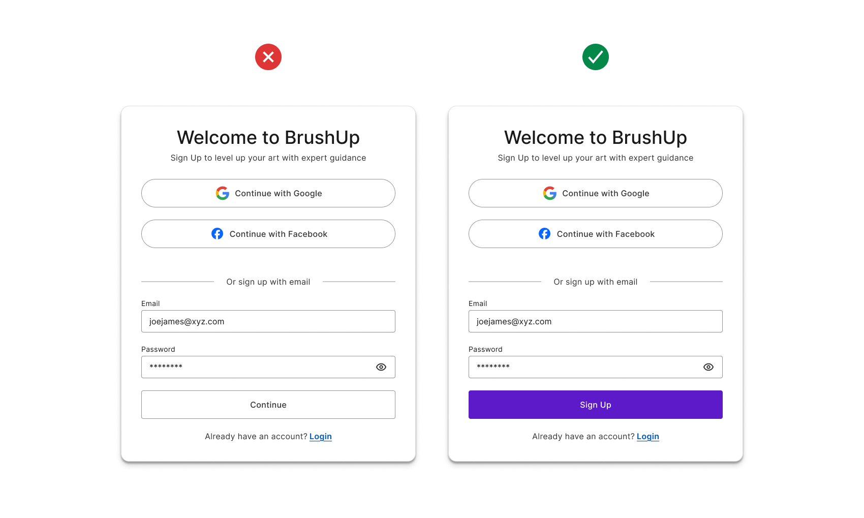
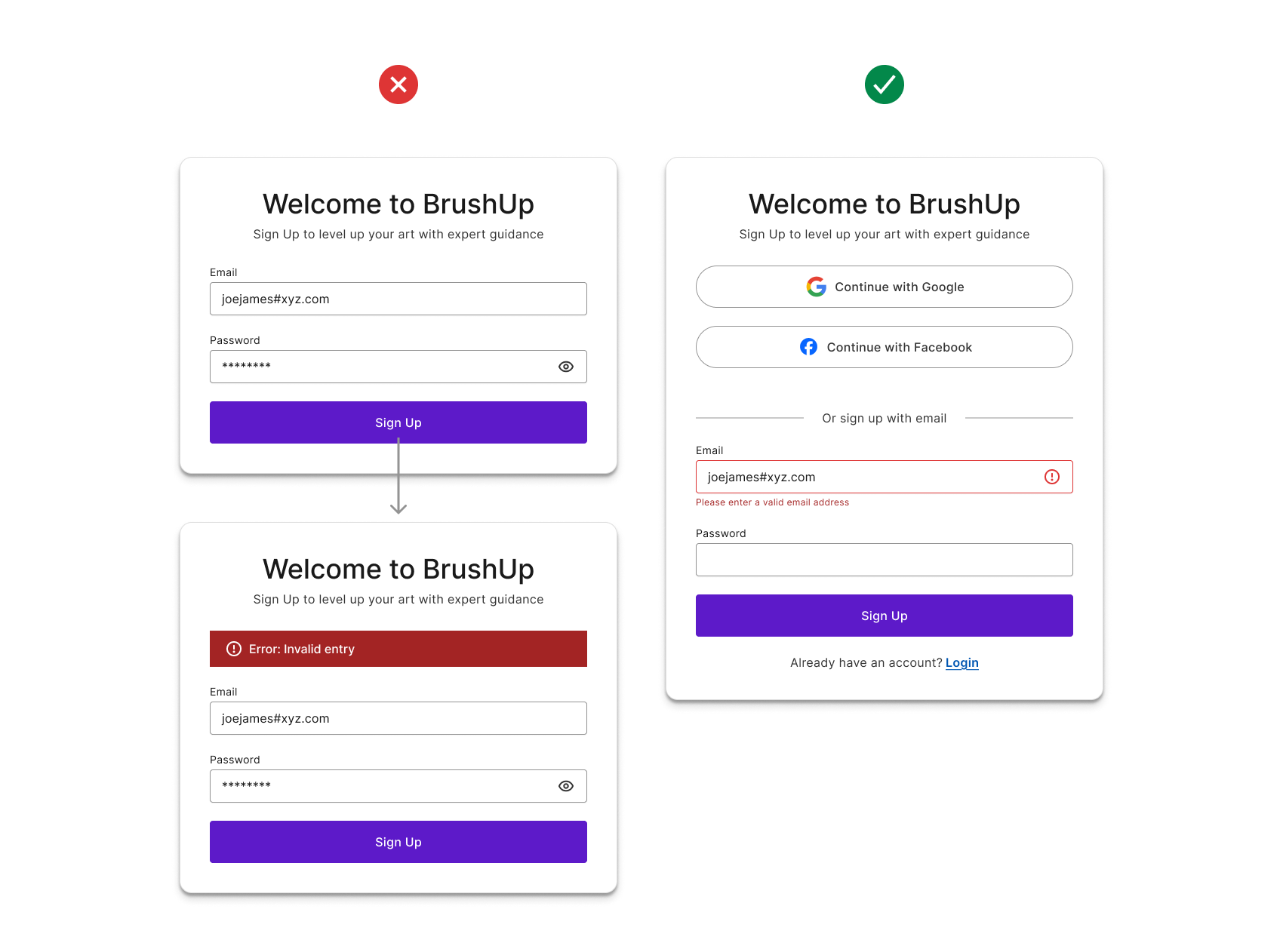
Provide social login methods
Social sign-ups make it easier and faster for users to create accounts by letting them sign up with Google, Apple, or Facebook instead of filling out long forms or remembering new passwords. This improves security, builds trust, and helps users log in quickly without frustration, making the overall experience smoother and more enjoyable.
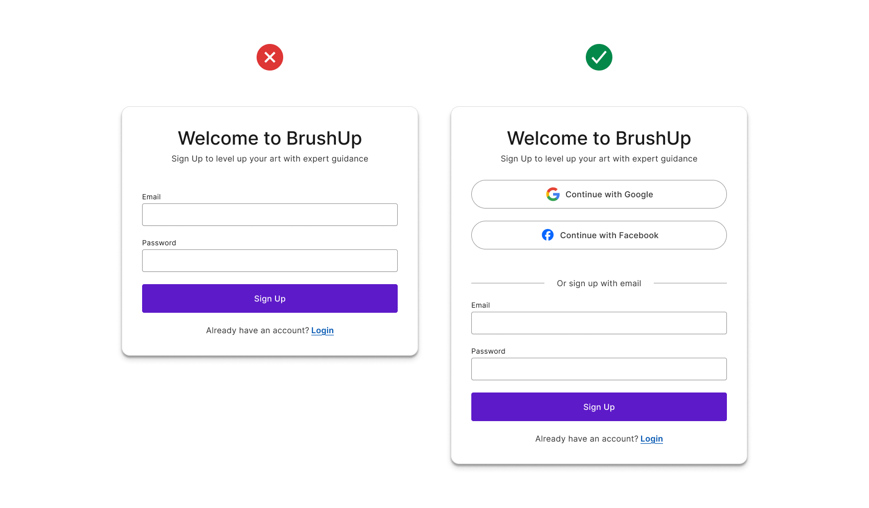
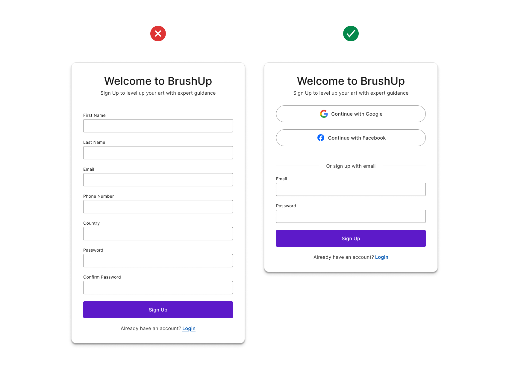
Keep it simple
Only ask for essential information like email, and password, and if additional details are needed, use a progressive disclosure approach to reveal them gradually.
Inline validation & error feedback
Real-time validation allows users to correct mistakes as they type by providing instant feedback, which reduces frustration and improves accuracy. Error messages should clearly explain the issue and how to fix it, using both color and icons to ensure accessibility. This makes the sign-up process easier and helps prevent errors before submission.
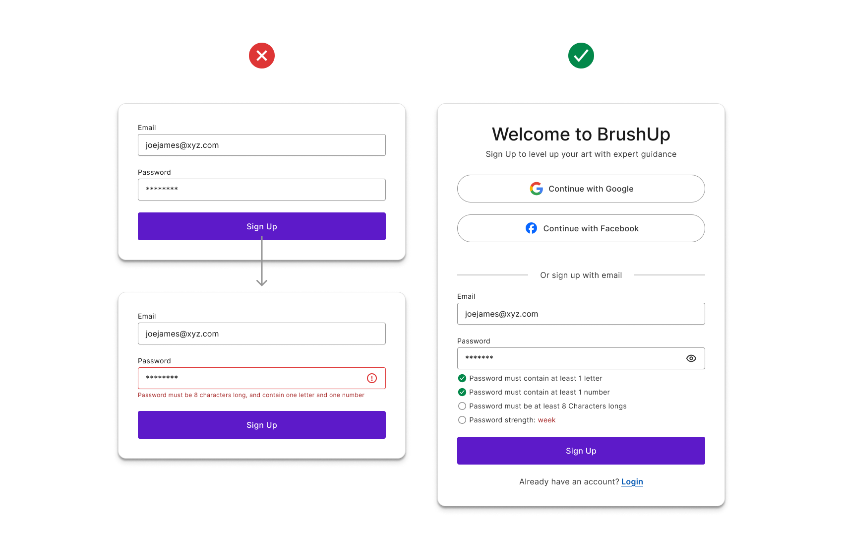
Optimize password creation
Display a password strength indicator to help users create secure passwords by showing whether their input meets security requirements. Additionally, provide a "Show Password" toggle so users can view what they’ve typed, reducing errors and frustration during sign-up.
Clear call-to-action (CTA)
Use a clear and descriptive button label, such as "Create Account" or "Sign Up" instead of a generic "Continue," to help users understand the action they are taking. Ensure the call-to-action (CTA) button is prominently placed, visually distinct, and easy to find, making it clear where users need to click to complete the sign-up process.